

Super admin . 2nd Aug, 2023, 4:08 PM
In today's data-driven world, the ability to
convey complex information in a simple and engaging manner is paramount. Data
visualization is the bridge between raw data and meaningful insights. This
article delves into the fascinating world of data visualization, exploring its
significance, techniques, and the impact it has on decision-making and
storytelling.
1.
Introduction
2.
The Power of Visual Communication
3.
Types of Data Visualization
o
3.1 Bar Charts
o
3.2 Line Graphs
o
3.3 Pie Charts
o
3.4 Scatter Plots
4.
The Psychology of Data Visualization
o
4.1 Color Psychology
o
4.2 Cognitive Load
5.
Best Practices in Data Visualization
o
5.1 Choosing the Right Chart
o
5.2 Labelling and Titles
o
5.3 Simplicity vs. Complexity
6.
Tools for Data Visualization
o
6.1 Tableau
o
6.2 Microsoft Power BI
o
6.3 Google Data Studio
7.
Data Visualization in Business
o
7.1 Sales and Marketing
o
7.2 Finance and Budgeting
8.
Data Visualization in Research
o
8.1 Scientific Research
o
8.2 Social Sciences
9.
The Future of Data Visualization
10. Conclusion
11. Frequently Asked Questions
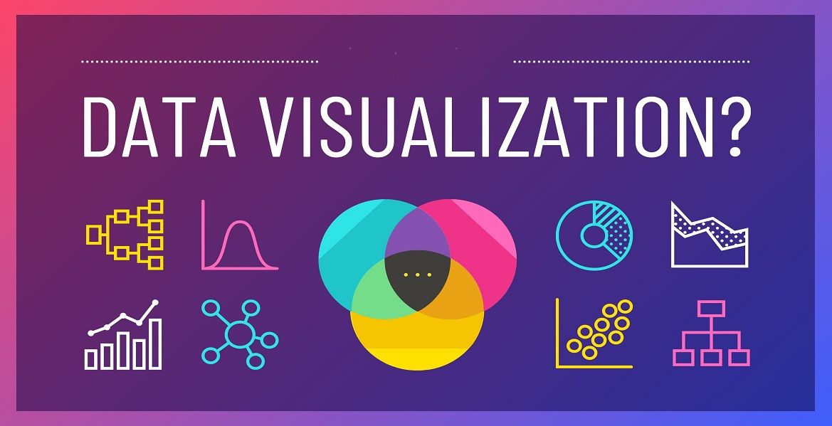
Data visualization is a powerful tool that
transforms raw data into comprehensible visuals. It is the art of representing
data graphically to help individuals and organizations gain insights, make
informed decisions, and tell compelling stories. In a world inundated with
information, data visualization plays a crucial role in simplifying complexity.
Our brains are wired to process visual
information faster than text. Visuals, such as charts, graphs, and images,
allow us to absorb vast amounts of data quickly. This makes data visualization
an invaluable method for conveying information efficiently.
Data visualization aids in simplifying
intricate data sets, making them more understandable and accessible. Whether
it's financial reports, scientific findings, or market trends, visualizing data
helps people grasp the core message with ease.
Data visualization comes in various forms,
each suitable for different types of data and purposes. Let's explore some
common types.
Bar charts are excellent for comparing data
across categories. They are particularly useful for showing changes over time
or comparing quantities between different groups.
Line graphs are effective for displaying
trends and changes over a continuous interval. They are frequently used in
time-series data to show how values evolve over time.
Pie charts represent parts of a whole. They
are ideal for illustrating the composition of a data set, such as market share,
budget allocation, or demographic distribution.
Scatter plots are used to visualize the
relationships between two variables. They help identify correlations and
outliers, making them valuable in scientific research and business analytics.
Colors in data visualization can convey
emotions and messages. Understanding color psychology is crucial to evoke the
desired responses from your audience.
Minimizing cognitive load is essential in data
visualization. Overloading viewers with excessive information can hinder
comprehension. Keep it simple, and focus on the essentials.
Selecting the appropriate chart for your data
is paramount. Use bar charts for comparisons, line graphs for trends, and pie
charts for composition. The right choice ensures clarity.
Clearly label your charts and provide
meaningful titles. Labels and titles guide viewers and prevent confusion.
Balance is key. While simplifying data is
essential, avoid oversimplification that may omit critical details. Strive for
a balance between simplicity and complexity.
Tableau is a leading data visualization tool
that offers a wide range of options for creating interactive and shareable
visualizations. It is widely used in business analytics and reporting.
Power BI is a powerful data analytics and
visualization tool from Microsoft. It integrates seamlessly with other
Microsoft products, making it a favourite for many businesses.
Google Data Studio is a free tool for creating
customizable reports and dashboards. It's popular for its simplicity and
compatibility with other Google services.
Data visualization has significant
applications in the business world. Let's explore how it benefits different
sectors.
In sales and marketing, data visualization
helps analyse consumer behaviour, track sales trends, and make strategic
decisions. Visualizing customer data aids in targeted marketing and campaign
optimization.
Financial data is often complex. Data
visualization simplifies financial reports, making it easier for stakeholders
to understand budgets, expenses, and revenue.
Data visualization is fundamental in
scientific research. It helps researchers interpret experimental results,
identify patterns, and communicate their findings effectively.
In the social sciences, data visualization is
used to analyse surveys, demographic data, and social trends. It aids in
drawing meaningful conclusions from complex data sets.
As technology advances, so does the field of
data visualization. Emerging trends include real-time data visualization,
augmented and virtual reality visualizations, and the integration of AI to
enhance data analysis.
Data visualization is an art and science that
empowers individuals and organizations to make sense of complex data. Its
ability to engage the human brain, simplify information, and enhance
comprehension makes it an indispensable tool in today's data-centric world.
Whether in business, research, or everyday life, data visualization is the key
to unlocking the potential of data.
Data visualization is the graphical
representation of data to make it more understandable and accessible. It uses
various visual elements like charts, graphs, and maps to convey complex
information.
Data visualization is important because it
helps in simplifying complex data, making it easier to understand. It enables
individuals and organizations to gain insights, make informed decisions, and
communicate data effectively.
Best practices in data visualization include
choosing the right chart for your data, labelling and providing meaningful
titles, and finding the right balance between simplicity and complexity.
In business, data visualization is used for
sales and marketing analysis, financial reporting, and strategic
decision-making. It helps businesses understand customer behaviour and
financial data.
The future of data visualization involves
real-time and interactive visualizations, augmented and virtual reality
applications, and the integration of artificial intelligence for advanced data
analysis.
Data visualization is a powerful tool that
enables us to simplify complex data, make informed decisions, and effectively
communicate information. It has widespread applications in business, research,
and various other fields. As technology continues to evolve, we can expect even
more innovative and interactive data visualization techniques in the future.
So, embrace the world of data visualization and unlock the potential of your
data today.
Our customer support team is here to answer your questions. Ask us anything!

Hi, How can I help?