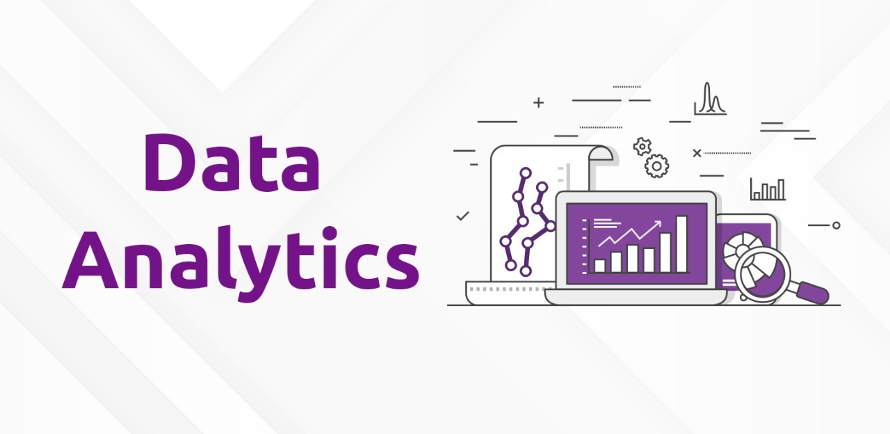
How Data Visualization Enhances Analytics Insights
Why Data Visualization Matters in Today’s Data-Driven World
Every day, businesses generate massive amounts of data. But raw data alone doesn’t help unless it’s transformed into useful insights. This is where data visualization in analytics plays a key role. It turns complex data into clear, easy-to-understand visuals that help you see the bigger picture and make better decisions.
If you're looking to learn data skills that include visualization tools and practical analytics, check out our data analytics course in Bangalore.
What is Data Visualization?
Data visualization is the use of visual elements like charts, graphs, and dashboards to represent data. It helps simplify large datasets and highlights trends, outliers, and relationships in the data.
Example:
A simple line chart showing monthly sales can instantly reveal which months performed best — something that’s much harder to see in a spreadsheet with rows of numbers.
Why is Data Visualization Important in Analytics?
- Understand trends quickly: Visuals highlight patterns and changes over time.
- Spot outliers and errors: Unusual data points are easier to detect.
- Make faster decisions: Simplified visuals reduce time spent analyzing data.
- Communicate findings clearly: Stakeholders can understand insights at a glance.
- Boost engagement: Visuals are more engaging than plain reports.
How to Use Data Visualization in Decision-Making
Real-world Applications:
- Dashboards: Used for real-time performance tracking (sales, traffic, customer behavior).
- Trend analysis: Line charts and heat maps show performance over time or by category.
- Forecasting: Visual models present predictions in a simplified way.
- Report simplification: Replace lengthy spreadsheets with focused charts.
Using visual tools helps businesses act on data faster and more confidently.
Top Visualization Tools for Analytics
- Microsoft Power BI: Ideal for interactive dashboards and real-time reports.
- Tableau: Known for stunning visuals and drag-and-drop ease.
- Google Data Studio: Great for Google product integrations and free reporting.
- Looker: Advanced, scalable data platform for enterprises.
- Qlik Sense: Fast and powerful analytics with smart data visualizations.
Real-World Example
Imagine managing a retail chain with sales data from hundreds of stores. Manually analyzing it is a nightmare. But with Power BI, you create a dashboard showing:
- Monthly sales trends
- Top-performing stores
- Customer demographics
- Inventory levels
Now you can instantly spot where to focus your marketing or reduce inventory — that’s the power of data visualization in analytics.
Benefits of Data Visualization
- Faster discovery of insights
- Clear storytelling with data
- Engaging and digestible reports
- Quick error spotting
- Confident, data-driven decisions
Final Thoughts
Whether you’re a business leader, analyst, or student, mastering data visualization in analytics helps you simplify complexity and turn data into action.
Start learning how to use the top visualization tools and techniques with a hands-on course. Explore our data analytics course in Bangalore at Vtricks Technologies to begin your journey.